How to choose the perfect colour for your kitchen
A splash of colour is a fabulous way to stamp your own personality on your home.
And, with the increasing trend towards colour in the kitchen, it’s a great time to consider how you could brighten things up.
Your kitchen – the heart of your home
According to Ideal Home the average Brit spends 351 minutes per week doing chores in the kitchen (that’s almost 6 hours).
And, if your kitchen is also the place where you eat, entertain or spend family time together, then you can easily double that number!
With the careful use of colour in your kitchen you can enhance every moment you spend there, whether you’re looking for a sophisticated space for entertaining or something a bit more fun for family life.
How colours affect us
Much research and theorising has been done into how colours affect our mood. Here are just a few nuggets of this collective wisdom which might help you choose colours for your kitchen…
Red

This is a bold, energetic colour. On the one hand it stands for love and passion. On the other it’s associated with anger and danger (eg fire and blood) – it’s probably for this reason that it’s not often found as a dominant colour in kitchens!
Having said that, red is a symbol of happiness and good fortune in many Asian countries. Plus, it’s thought to stimulate the appetite (it’s no coincidence that so many fast food brands have red in their logo). So, don’t dismiss it entirely!
Orange

Another energetic colour, orange has much of the boldness of red, but mellowed with yellow tones. It’s associated with fun, youth and vibrancy – so it could be a great accent colour for a family kitchen. Though, of course, you have to be able to forget its overuse in 1970s kitchen designs!
Yellow

Almost everyone loves the sunshine cheerfulness of yellow. Like orange, this perhaps isn’t a colour to use as the base for your kitchen (unless you want to feel like you’re cooking inside a high vis jacket!), but it’s a wonderful accent choice, particularly when used with dark blues.
Green

Opinion tends to be very divided over green – some people love the fresh, balanced, natural feel of it. Others just can’t get past the thought of avocado bath suites!
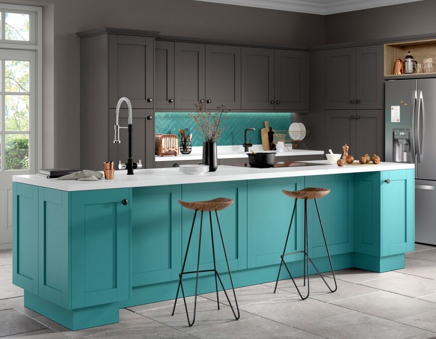
If you love it then a deep green can be a powerful base colour for your kitchen. Alternatively, pops of lime green or turquoise can provide a stimulating contrast to more neutral colours.
Blue

An increasing number of customers are seeking blue kitchens and it’s easy to see why this perennially popular colour is so universally loved.
Reflecting the natural colours of the sky and sea, blues have a peaceful, calming quality that can make a kitchen a pleasure to use. But it can be important to include an accent colour (perhaps yellow or pink) so that you don’t feel too “blue” in your kitchen.
Purple

While not traditionally a colour often used in kitchens, purple is seeing a resurgence, particularly in more feminine, lilac or lavender tones. Depending on the shade used, it can either create a warm or cool feel.
Darker purples are associated with royalty or nobility (probably because purple pigments were so expensive in ancient times that only the rich could afford to wear purple). So perhaps it’s a bit grand for a kitchen? Or maybe it would set the perfect tone if you entertain a lot?!
Pink

Another colour on the up for kitchens is pink. Undeniably associated with femininity in the western world, pale pinks have a soft, sentimental air. But think of the other end of the pink spectrum and you have hot pinks/magentas, packed with fun and excitement.
Interestingly, pink was originally considered a boy’s colour, because red was thought of as masculine, so the derivative pink was associated with boys.
Choosing your base colour
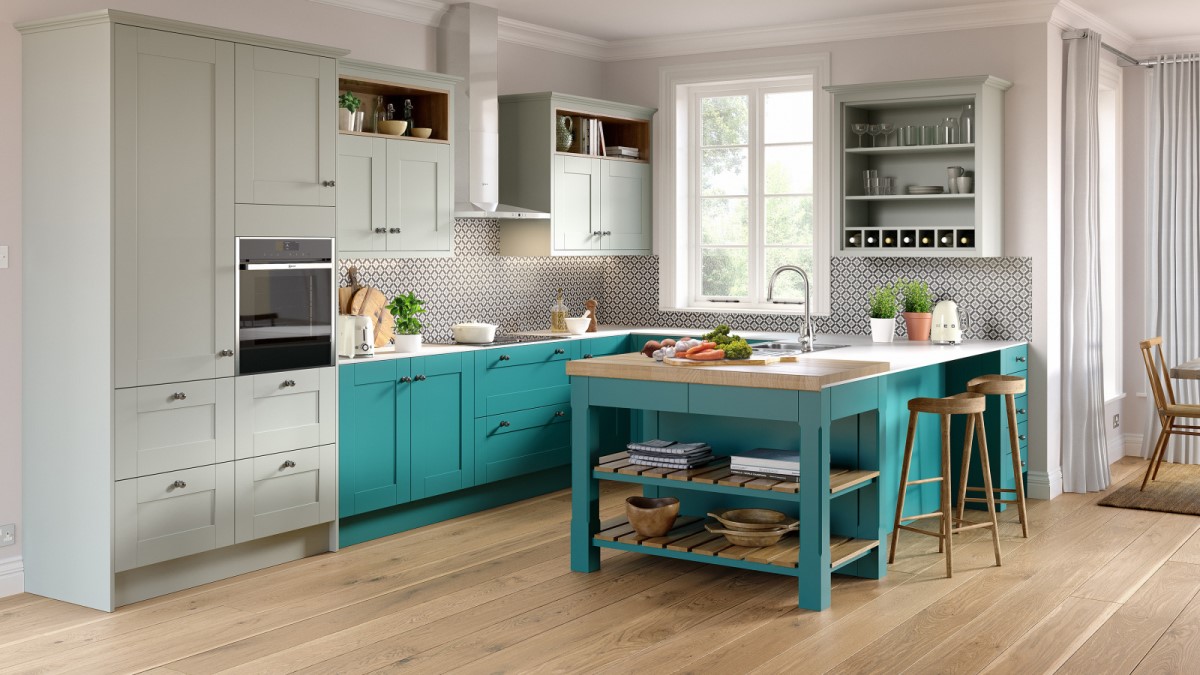
The base colour will be the most dominant colour you use in your kitchen. Generally, people will select a fairly restrained palette for their base colour, often blues or neutrals such as greys or whites.
Using a more subtle base colour grounds the kitchen and stops it having too much of a “primary school classroom” feel.
Choosing your accent colour
Now you know the base colour you’re going to use in your kitchen, you can start to have some real fun selecting your accent colour or colours.
Accent colours are used to lift the base colour and are usually complementary (energising) or analogous (calming) matches.
Complementary and analogous colours are found using a colour wheel:
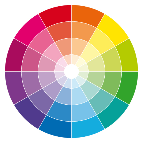
First you find your chosen base colour. Then, if you want a complementary accent colour, select the colour which is opposite on the colour wheel. This provides a high contrast and high impact combination.
For a more subtle effect, you could select analogous colours as your accents. To do this, find your base colour, then choose the colours either side of it for your accents.
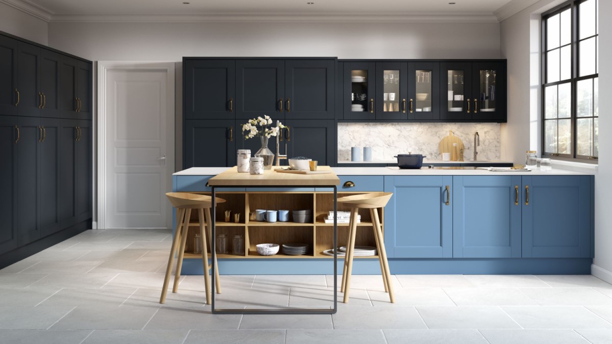
If your base colour is a neutral colour, such as brown, black, white or grey, then you can choose any accent colour you like!
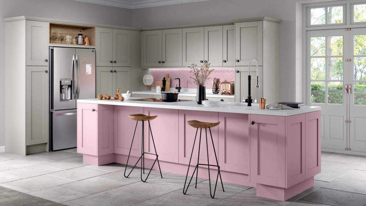
Once you have your accent colour or colours you can decide how to use them. They could be a subtle pop of colour (using appliances, cushions, ornaments or stools) or they could be a stronger “colour block” feature of the room (by using an accent colour for a whole section of cabinets or a large splashback).
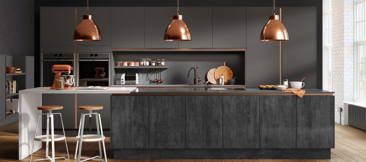
Of course, you could ignore the colour wheel and just pick colours that you love. They might clash, but if the eclectic feel suits you then go for it! Just be a little cautious – too much colour can make a small kitchen feel even smaller, so perhaps keep to a neutral base and go all technicolour with your appliances and furnishings?
The Omega 2020 Kitchen Collection
This article has been inspired by the new kitchen collection coming out next year from Omega.
Following extensive research into colours, styles and trends, they’ve developed this new range to bring more colour to your kitchen. Whether you’re seeking dark sophistication or a bright family hub, you’ll find the perfect colour combination for you.
Here’s just a sample of what you can now achieve:


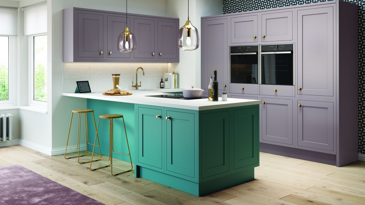
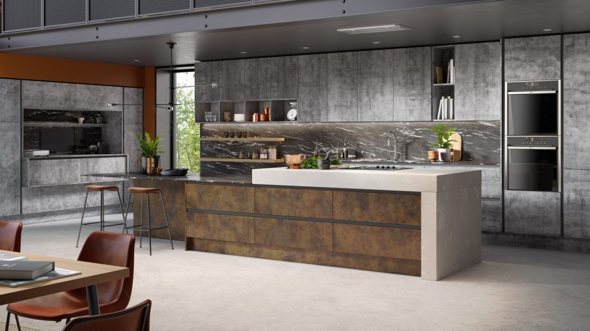
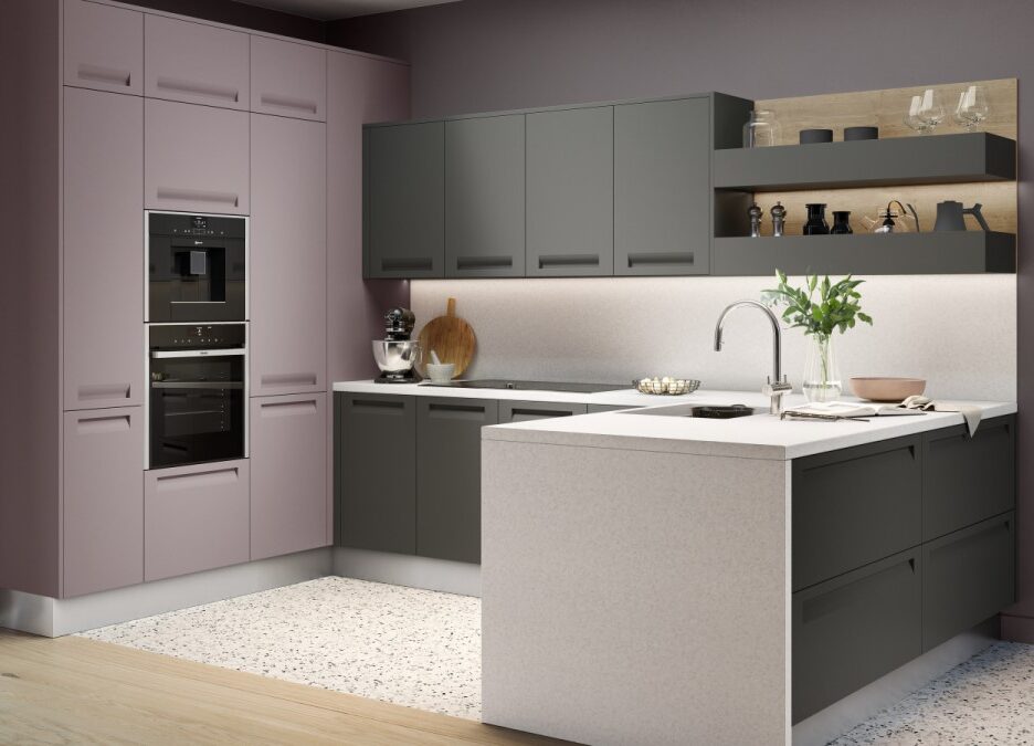

Start designing your 2020 kitchen now!
Our kitchens aren’t fitted overnight – to achieve the quality and style of finish which you deserve, it takes a bit of planning.
So, if you’re looking to revamp your kitchen in 2020 and make the most of these fabulous new colours, now’s the time to start!
To find out more call us on 01825 76 76 28 or pop in to our Uckfield Showroom.